A Fresh Look for Future Innovators
We rebranded Teenovator, a platform that empowers high school students through mentorship and entrepreneurship. The new identity features a dynamic handwritten logo, a bold neon yellow and deep green palette, and playful doodle-inspired graphics. The result? A fresh, energetic brand that captures Teenovator’s mission—helping teens develop skills, innovate, and launch their own ventures with confidence.
Annual Report
Annual Report
Brand Guidelines
Brand Guidelines
Brochures & Flyers
Brochures & Flyers
Data visualisation
Data visualisation
Digital Business Strategy
Digital Business Strategy
Interaction design
Interaction design
Logo
Logo
Logo Animation
Logo Animation
Merchandise
Merchandise
Motion Graphics
Motion Graphics
Stationery
Stationery
Visual Identity
Visual Identity
Website Design
Website Design

Teenovator’s original logo had, let’s say, an identity crisis. The mix of Bulgarian and English lettering created a mid-word traffic jam, making it a headache for everyone—from the CEO to event attendees. Our mission? Untangle the mess, shorten the logo, and give it a sleek, modern feel without losing its youthful energy. But that wasn’t all—the brand also needed a fresh visual identity to stand out from the sea of event industry competitors. The challenge? Make it bold, make it fun, and make sure no one needs a second look to figure out how to read the name.


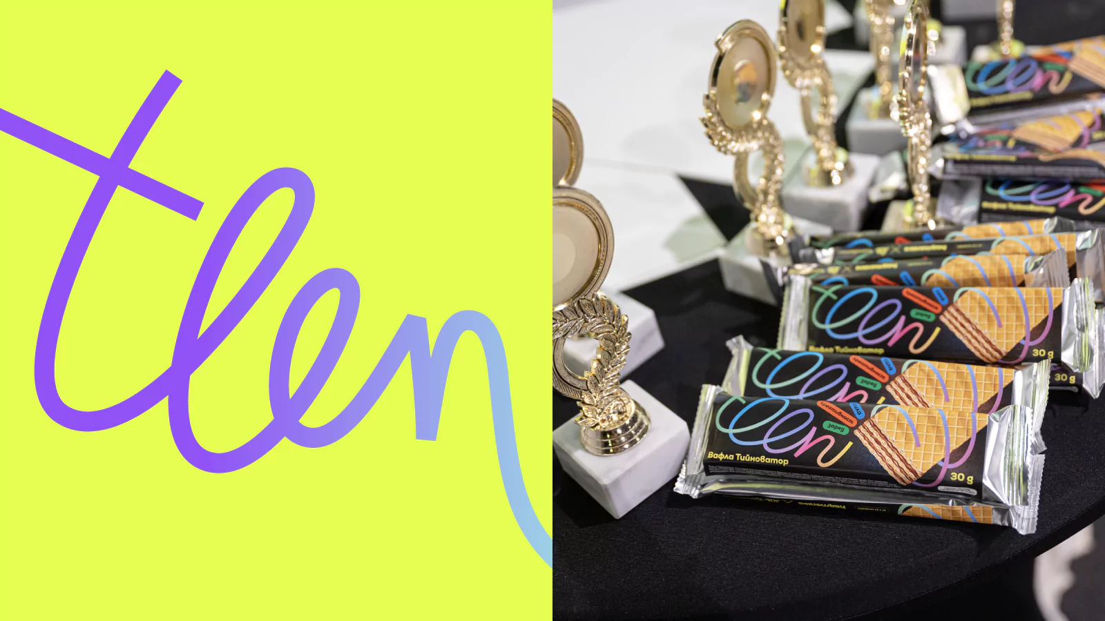
After playing around with various styles (and some existential debates about what truly embodies “teen spirit”), we landed on a handwritten logo because nothing says youthful energy like a bit of organized chaos. The new symbol, derived from the intertwined “e” letters in “teen,” looks like a spring—bouncy, dynamic, and full of potential, much like the teenagers Teenovator supports. The color scheme? Neon yellow and deep green—bright enough to grab attention but polished enough to mean business. We kept Nexa as the main font but introduced Garet (by Typeforward) for added punch, along with a quirky typographic trick: mixing handwriting with structured type to emphasize key words and phrases. And because no teenager's notebook is complete without doodles, we integrated a playful hand-drawn line motif—circling photos, sketching hearts, and generally making the brand feel alive.


However, a bold new identity needed a digital home that was just as energetic and purpose-driven. The revamped Teenovator website is designed to connect a diverse crowd—from high school students and mentors to potential partners, sponsors, and even the “invisible” decision-makers like parents, school admins, and industry professionals. We mapped out the initiative’s entire lifecycle and built a site that fits seamlessly into the journey of each audience.
The result? A clean, intuitive structure, dynamic interactions, and smartly placed CTAs that pop up exactly when needed. Navigation got a major upgrade, with filters for complex lists, seamless “next” and “previous” page links, and a footer packed with essential resources. Forms? Optimised for clarity—no more frustrating guesswork. To keep visitors engaged, we added interactive widgets that prevent dead-ends and encourage deeper exploration. And, of course, every touchpoint is wrapped in Teenovator’s fresh, high-energy aesthetic, making the experience feel less like browsing a website and more like jumping headfirst into an exciting new adventure.


With its fresh new look, Teenovator is no longer just an event—it’s a movement, inspiring young entrepreneurs to dream big and think even bigger. The rebrand injects energy, clarity, and a dash of rebellious creativity into everything from digital materials to event branding. No more confusing spellings—just a bold, engaging identity that makes Teenovator stand out like a neon sign at a dark concert. Mission accomplished. Now, onto changing the future, one brilliant teen at a time!

Check out the interview with Krasimir Stavrev, owner and CEO of PUNKT, for Teenovator. February 17, 2025.
The rebranding of Teenovator has resulted in a cohesive program where the packaging aligns well with the content. The fresh design reflects the essence and spirit of Teenovator. The project's beneficiaries see themselves represented in this new vision, which makes it easier for us to attract new individuals, including mentors, students, and partners.


