Linking art with a space of its own
Shaping ideas into a living system and visual language is quite the responsibility. But we like challenges. That was the case with Ilinka Tchergaroff’s project. She came to us with one goal – to help her bring to life her vision for an art space that links people.
Ilinka Tchergaroff
Brand Guidelines
Brand Guidelines
Logo
Logo
Logo Animation
Logo Animation
Motion Graphics
Motion Graphics
Naming
Naming
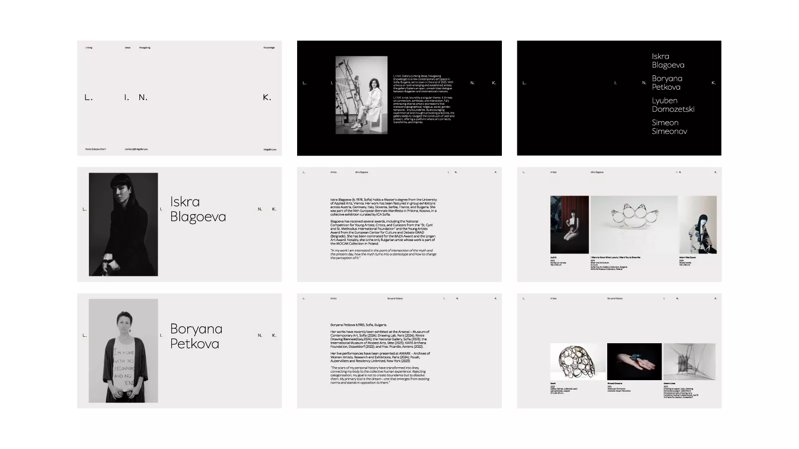
Presentation Templates
Presentation Templates
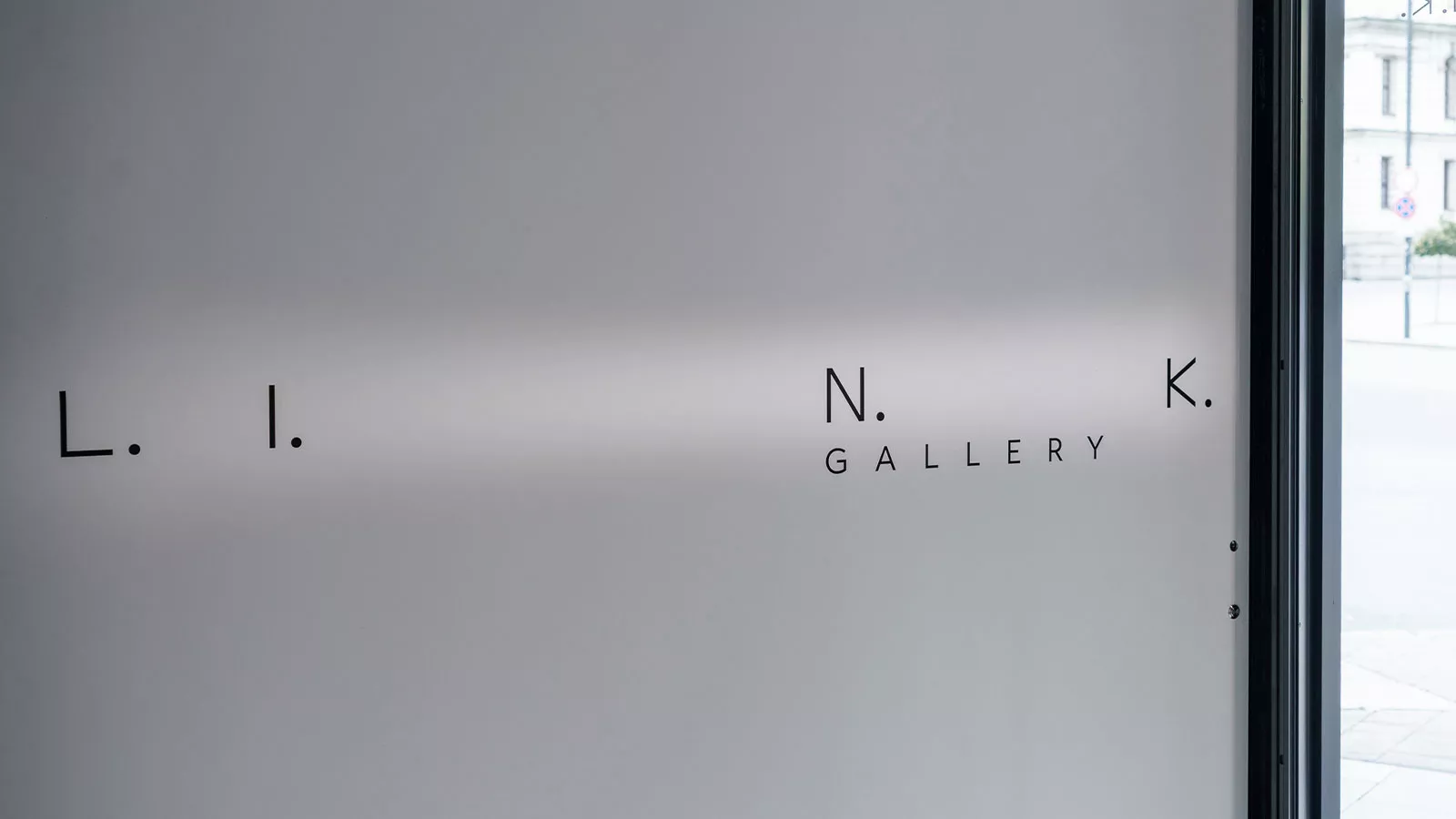
Signage & Wayfinding
Signage & Wayfinding
Stationery
Stationery
Visual Identity
Visual Identity
Our work on the identity of L.I.N.K. Gallery began with a search for a name. It was a collaborative process involving people from both the gallery and our design team. Initially, we landed on LINK because of its connection to Ilinka Tchergaroff, the person at the heart of the gallery, and her broader goal: bringing people, ideas and cultural perspectives together in one space. Then the gallery team came up with the tagline “Linking Ideas. Navigating Knowledge.”, turning the word into an acronym and adding another layer of meaning to the name L.I.N.K.
L.I.N.K. Gallery was envisioned as a living, dynamic space that constantly evolves – a place where contemporary artists feel supported and find a natural platform for their work. A space for exchange and interaction, connecting contemporary, modern and classical art. Ilinka herself is a conservator, approaching her work with exceptional attention, precision and care, so we wanted to emphasize those same qualities in the visual identity.
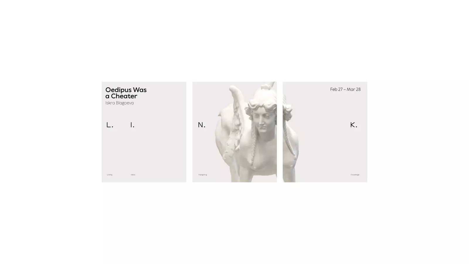
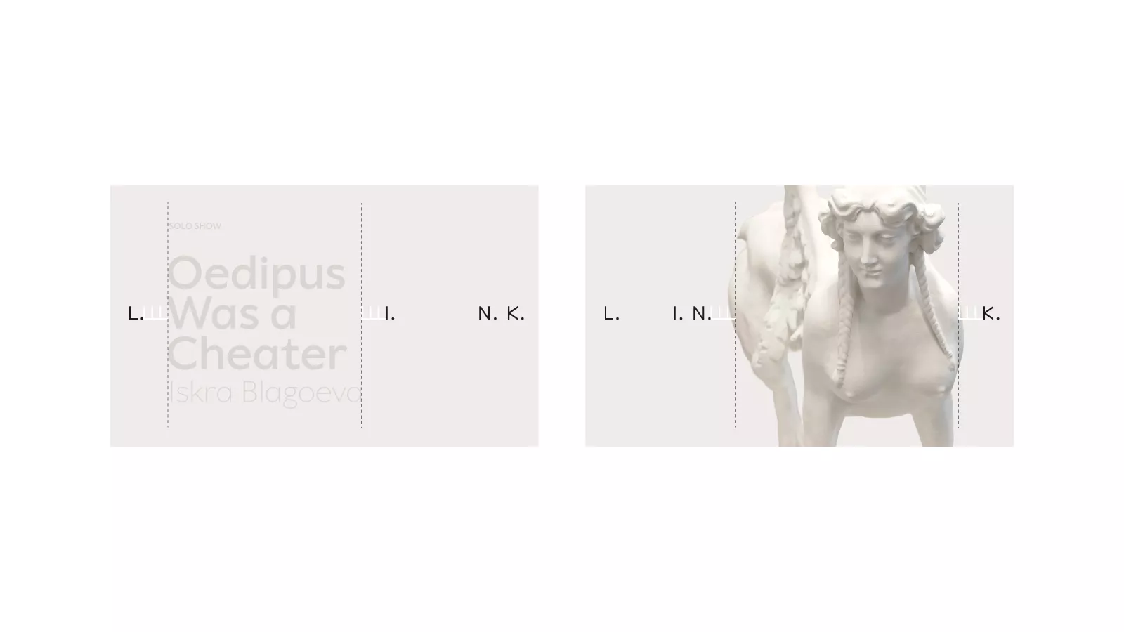
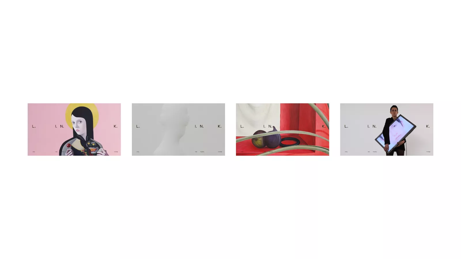
While building the visual system, we kept reminding ourselves of the core idea behind the gallery – linking people together. So we decided to portray this linking by dividing the letters of L.I.N.K. thus creating a space for the artists, some key information, images or artworks to put in between. When put into motion, the letters move and come together briefly, then the spacing opens again according to the next content and format. This turns the gallery’s name into a flexible yet clearly structured system, with the space between the letters becoming the foundation of the entire identity.
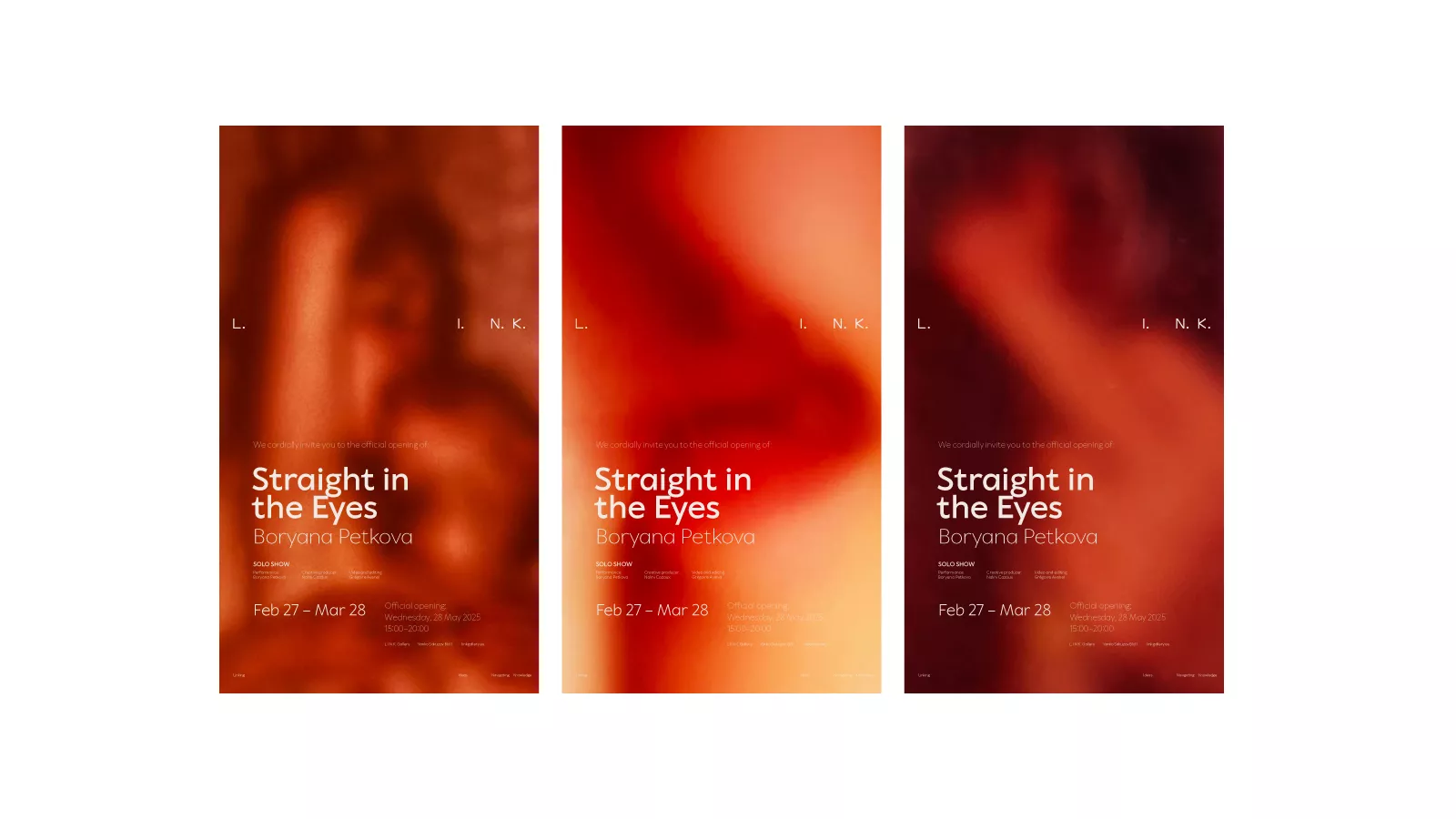
We kept the typography and primary colours relatively neutral, allowing the supporting colours to respond to the content, the artworks and the concept behind each exhibition. From there, we developed a system that allows for different ways of presenting the work. We can zoom in on individual details or display entire artworks between the letters, layer typography over images or let the visuals speak for themselves. Sometimes the gallery’s identity takes centre stage; other times, it steps back to give the artists, their work and the exhibitions more room to breathe.
While the idea of the motion was to set a clear rhythm and a sense of continuous movement, turning the identity into something that unfolds rather than simply appears.
We carried this principle across posters, invitations, presentations, printed materials and digital communication. The result is an identity that easily adapts to different artists, media and projects while remaining recognisable. An open space for art, ideas and connections – with enough structure to hold everything together, and enough freedom to let each new exhibition find its own voice – by Linking Ideas and Navigating Knowledge.