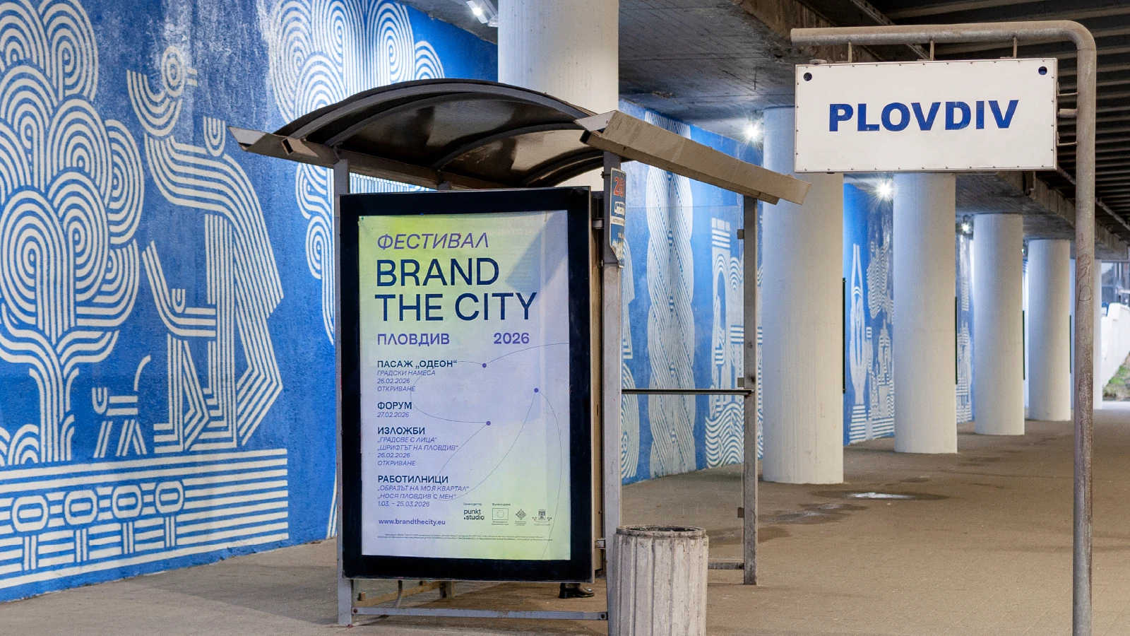
BRAND THE CITY Festival 2026
What does a city look like when its citizens help design it? That was the question behind BRAND THE CITY… and asking it wasn’t enough. We wanted to build a space where it could actually be answered. So we did. Our team conceived, organised, and realised Plovdiv’s first festival dedicated entirely to city design. A full-scale event we had never attempted before, and one the city had never seen.
Strategy
Strategy
Logo
Logo
Logo Animation
Logo Animation
Motion Graphics
Motion Graphics
Naming
Naming
Photography
Photography
Presentation Templates
Presentation Templates
Space Branding
Space Branding
Vehicle Branding
Vehicle Branding
Verbal Identity
Verbal Identity
Video Production
Video Production
Visual Identity
Visual Identity
Website Design
Website Design
Running from 26 February to 1 March 2026, the festival turned Plovdiv into a shared stage: part design forum, part urban intervention, part open invitation with exhibitions and workshops to anyone who calls the city home. Over five days, leading European design studios, policymakers, and citizens came together to explore how visual identity shapes the way cities communicate, distinguish themselves, and are collectively experienced. The result was something rare: a festival that was both professionally rigorous and genuinely open. Another proof, for us, that a design studio can do much more than respond to client briefs. hehe
The centrepiece of the festival was the BRAND THE CITY Forum: a one-day international event held at the Bishop’s Basilica of Philippopolis on 27 February 2026. On stage, nine speakers from across Europe shared the thinking behind visual identity systems developed for cities including Amsterdam, Vienna, Leipzig, Porto, and Prague. Lectures. Panel discussions. Real process, not polished mythology.
Before the forum opened, the city itself changed. As part of the festival programme, the Odeon Passage, connecting the Ancient Odeon of Philippopolis with the Bishop’s Basilica, was transformed through a public art intervention. Six large-scale murals brought together original poetry and illustration to give this essential urban corridor a new life. The grey walls became a gallery. The walk between two ancient landmarks became an experience.
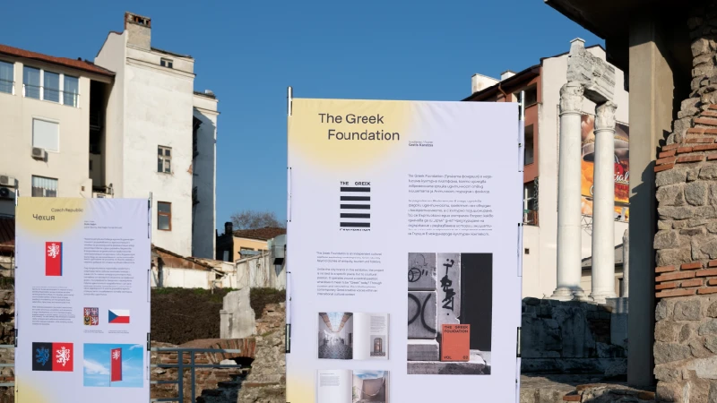
Two exhibitions ran alongside the forum, both asking the same underlying question from different angles. Cities with Faces explored how cities build visual identities, drawing on the work of Vienna, Leipzig, Amsterdam, Porto, Parma, and others as reference points. It opened at a deliberate moment: Plovdiv is actively developing its own new visual language, and the exhibition framed that process within a broader European context.
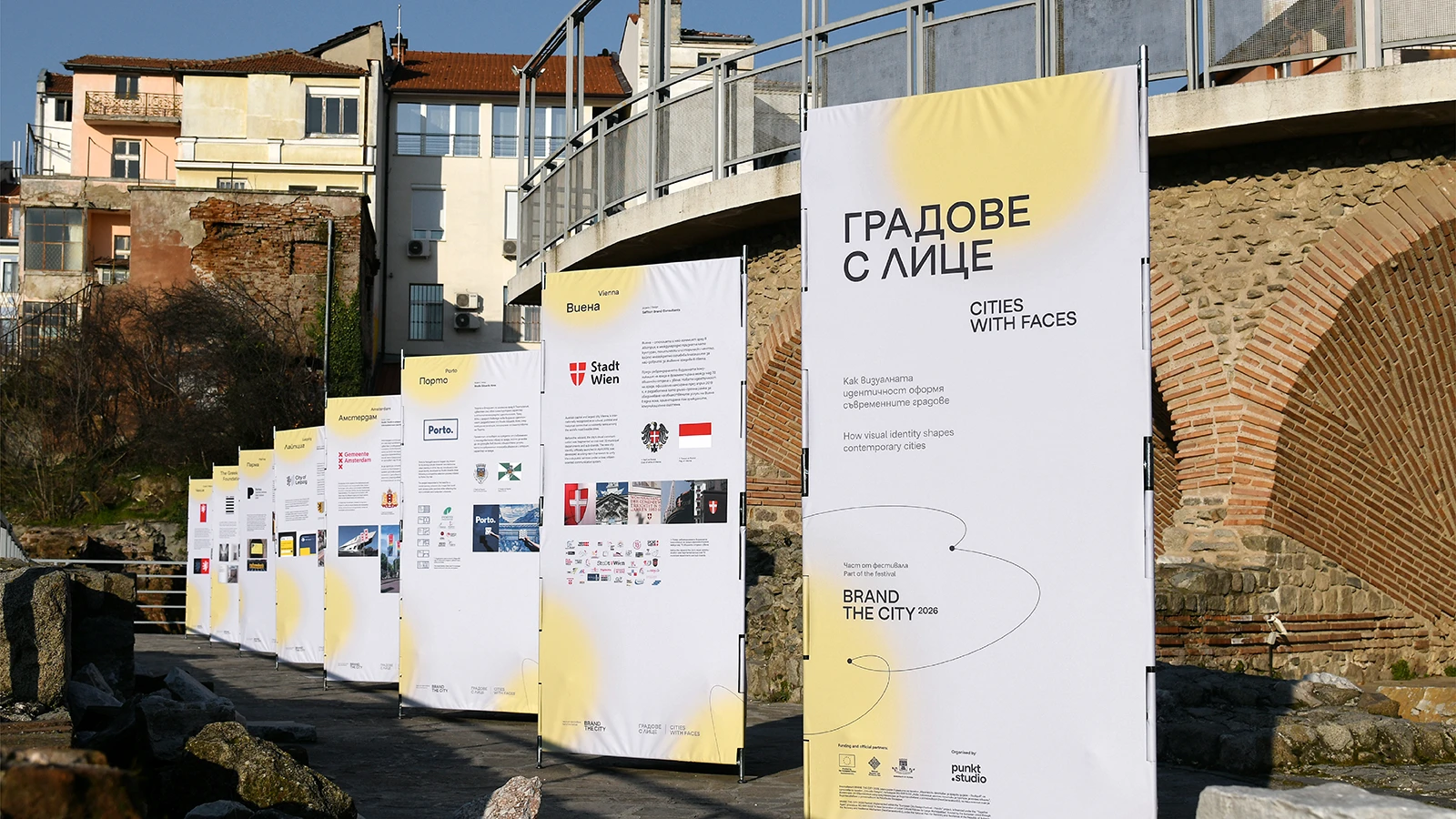

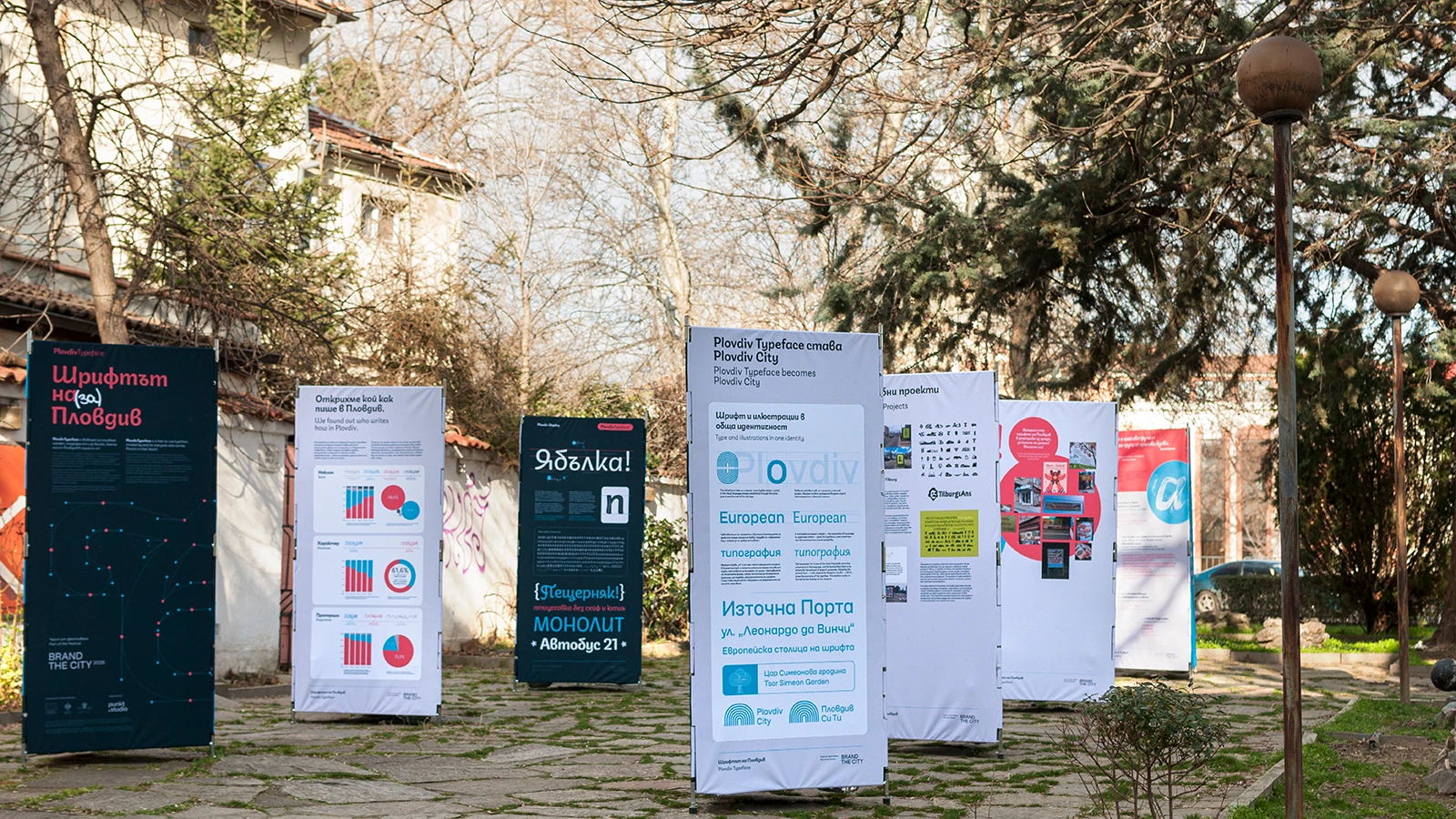
Plovdiv Typeface told a different kind of origin story. The exhibition celebrated the custom city font created for Plovdiv’s European Capital of Culture 2019. A typeface built from over 3,800 handwriting samples contributed by residents and guests of the city. Developed in collaboration between punkt.studio and Typedepot, the trio of Display, Script, and Sans variants captures something that most type systems don’t attempt: a city’s actual handwriting. Local slang included.


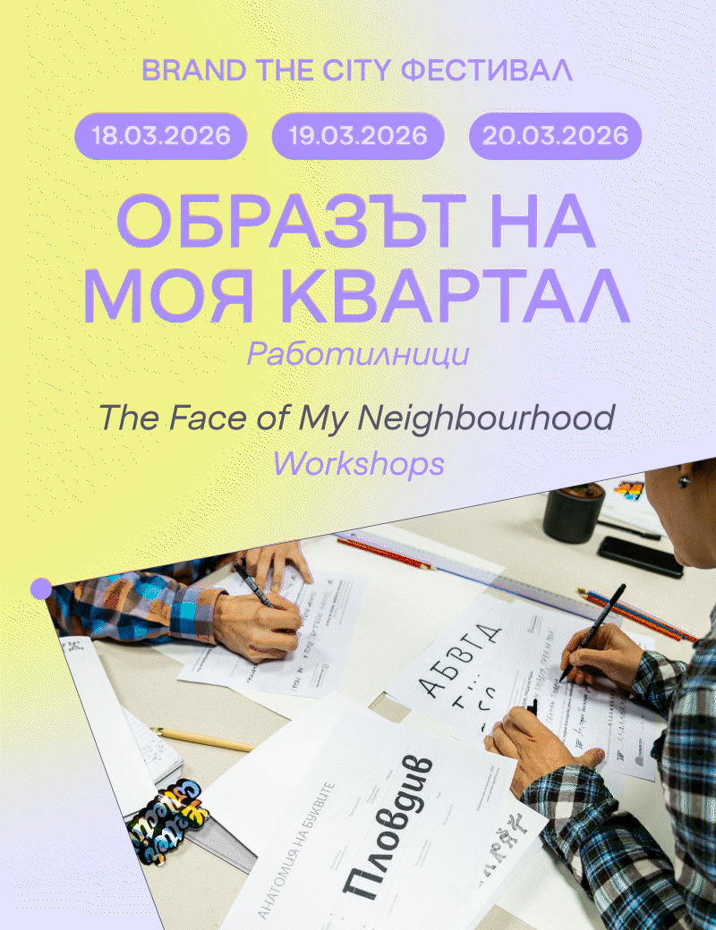
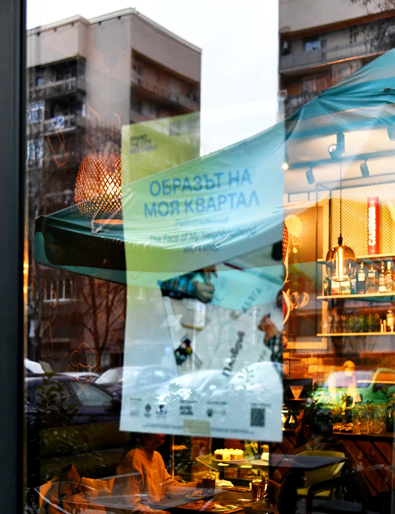
The festival extended beyond its formal programme with a series of workshops held across the city’s districts. The Face of My Neighbourhood invited participants in the South, North, and Kapana districts to translate their local experience into visual language through collage, conversation, and the symbols of Plovdiv’s identity. I Carry Plovdiv With Me took that one step further: participants designed their own T-shirts and tote bags using the Plovdiv Typeface, leaving with a keepsake that was entirely their own creation.
The festival’s visual identity was designed in collaboration with Crunchy Oyster and our team as an integral part of the project. Not a wrapper around it, but an expression of the same ideas the festival explored. The color palette moves between soft yellow-green and muted lavender across a gentle gradient, grounded by a deep charcoal for all typographic elements and an accent violet that carries the emotional weight of the system: city names, dates, labels, and key details. Nothing loud. Nothing competing. The colour logic mirrors the festival’s tone: considered, open, and warm.
Typography follows a similar principle of productive contrast. Large, extra-bold uppercase headers share the page with lighter regular counterparts, creating a rhythm that feels both confident and dynamic. The Lens Grotesk, designed by Alexander Nedelev and published by Typedepot, is a contemporary sans-serif typeface without being too “trendy”, in line with the European design studio context the forum itself was drawing from. The most distinctive element of the identity is structural: a system of thin, organic connecting lines and filled circular nodes that travel across compositions. They suggest network, movement, and relationship. The journey of an idea from one city to another, from a studio to a street, from a designer to a citizen. Simple. Repeatable. Quietly moving.
BRAND THE CITY 2026 didn't just present ideas about how cities communicate. For five days, across four components, it turned one city, learning to see itself differently, into a proof of concept.

Brand the City 2026 Festival is implemented within the “European City Design Festival – Plovdiv” project, financed under the “Together Again” procedure BG-RRP-11.021, funded by the European Union through the Recovery and Resilience Mechanism (NextGenerationEU), under the National Plan for Recovery and Resilience of the Republic of Bulgaria.


